In 2020 the web design world will be flipped upside down on its head. Those that can keep up will make serious gains, and those that cannot will fall by the wayside.
Staying relevant with the most up to date web design trends (in the forever-changing digital landscape) is critical to success.
So get your notepad out and start taking notes as these trends will dominate the web design landscape in 2020.
Flat illustration/designs have been around for a while.
Some big names like Slack and Shopify have been using them for a long time. In fact, the craze behind minimalistic designs is what gave rise to flat illustrations.
However, in 2020, that trend may (partially) die off.
Instead of ditching flat designs altogether, some websites have begun combining flat elements with 3D and dynamic designs (which also includes animations).
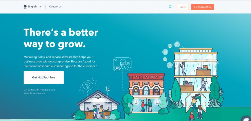
The current header on HubSpot’s homepage (partially animated) is a great example:
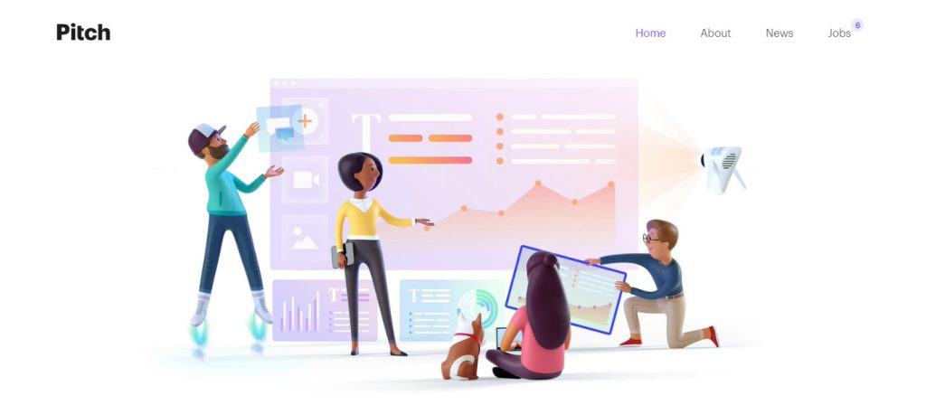
Another good example is this animated 3D illustration on Pitch’s website:
The aim is to find a middle ground between simplicity and complex designs.
This enriches the overall user-experience by taking your visitors through an immersive journey.
Not only does it look better and engaging, it can also help give your brand a persona.
Here’s how you can combine flat, 3D and dynamic designs on your website:
With voice becoming a major part of our lives, there’s one thing designers can’t stop talking about – voice user interface (VUI).
Voice user interface is a speech recognition technology used to interact with a device or application through speech.
It involves the overall user-experience of conversing with machines – including how the interface receives commands and to what extent a user can control the device/platform with their speech, among other things.
The exciting part is that the VUI application isn’t limited to search engines, smartphones, chat bots, and home assistants – the next big thing is ‘in-web voice features’. In other words, the ability to control a website using only speech.
For example, instead of having visitors type keywords in the search box, they could “speak” to the website.
To be more specific, let’s suppose you have a website that compares airline tickets.
Instead of having your users fill out extensive forms to view the available options, they could simply speak a command like, “show me available tickets from X to Y on Z date.”
By 2020 nearly 30% of browsing will be done without using screens. This means web designers will need to create practical VUIs for their websites to provide better experiences.
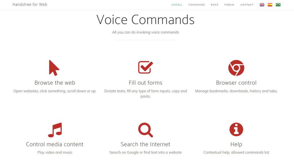
As of now, the closest thing we have to a web-based VUI is Handsfree for Web – a special Google Chrome extension that allows users to control their browsers using only speech.
The goal of any VUI is to minimize the use of hands (and screens) and maximize convenience.
While the concept of a voice-controlled website is still relatively new, the trend, if it kicks off, may redefine the world of web designing.
Here are a few pointers to get you started:
Thanks to platforms like WordPress and Wix, an average person with zero coding skills can create a website in just a few, simple steps.
These platforms offer an extensive range of free and premium design templates that you can implement with just a click – which is great if you’re low on budget or time.
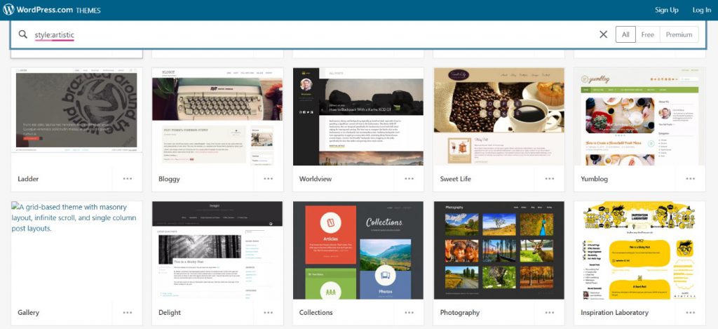
Even some large and medium-sized businesses have built their websites on these ready-made themes, despite having the budget to create new ones from scratch.
However, lately, we’re seeing more and more websites pop-up with unique, custom themes – another trend that’s expected to catch on in 2020.
Instead of completely relying on these themes, some businesses are investing in unique designs.
Brands are now mixing preferences of users with their own corporate goals, which can only be accomplished through strategic and customized website design.
The motive is to stand out and deliver a one-of-a-kind experience – one that makes users coming back for more – instead of creating a generic website from a template.
Here are some things to keep in mind when building a custom theme:
Virtual reality – a simulation of an interactive environment that resembles the real-world – has paved the way for the next level of user-experience.
With a VR headset, you can now explore the farthest corners of the universe at the speed of light, go back in time to pet dinosaurs, or ride a unicorn – the sky’s the limit (or distant galaxies in this case).
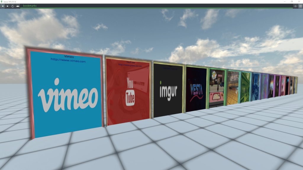
With that being said, “virtual reality websites” aren’t far from reality – in fact, some already exist.
Instead of looking like standard web pages, these websites deliver immersive virtual reality experiences.
Some developers have already created a few in the past, which can be accessed through JanusVR – a “virtual reality browser.”
Due to VR headsets being expensive (with the exception of the Google Cardboard), the concept hasn’t been implemented on a large-scale.
The most users can get these days are embedded VR experiences which are part of the overall experience.
But we still have yet to see fully-functioning websites that are completely based on virtual reality.
If such websites begin to pop up in 2020 and the trend catches on, it could make a number of traditional best practices for web design and SEO obsolete.
And the best part? You don’t need to be a hot-shot programmer to create immersive web-based VR experiences.
Here’s how you can get started on implementing a VR-experience on your website:

Parallax scrolling – a style in which the background images scroll at a slower speed than the foreground image – is a contemporary web design trend that’s not expected to die off any time soon.
In fact, it only continues to grow in popularity.
Parallax scrolling provides a captivating 3D effect and adds depth to the web design – immersing the user and providing that “wow” effect.
The three main types of parallax scrolling effects are:
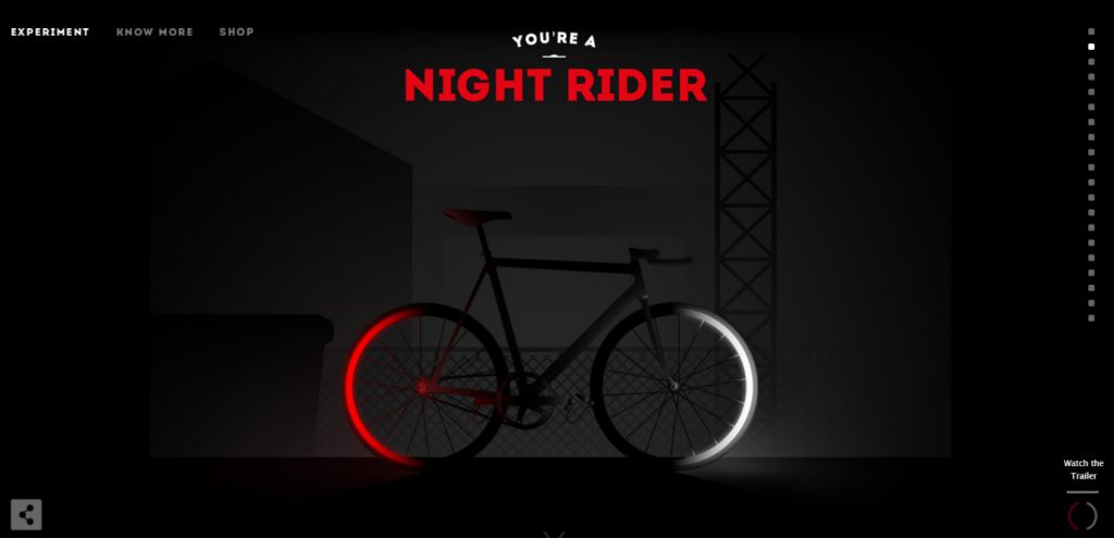
A great example of paralax in use is Cyclemon.com – an experiment that showcases different “fake” bikes using the power of parallax scrolling.
At the top, you can see a bike for “night riders:”
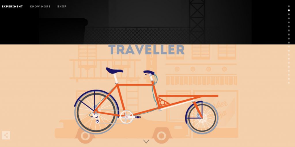
But, as you scroll down, the cycle moves faster than the background, and the screen eventually reveals the next section/bike:
Don’t be intimidated – the good news is that it’s actually quite easy to add such effects.
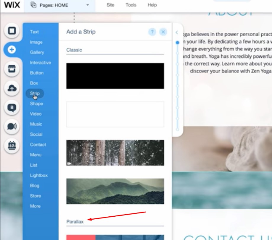
Here’s how you can add parallax scrolling to your website:
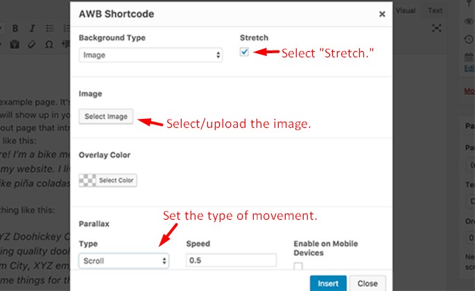
If you’re on Wix, you can use the Parallax strip to add the desired effect.
<div class=”parallax”>
<div class=”parallax-content”>
(Your content here)
</div>
</div>
Then, use this sample CSS code:
.parallax {
background-image: url(“the-URL-goes-here”);
height: 100%;
background-attachment: fixed;
background-position: center;
background-repeat: no-repeat;
background-size: cover;
margin-left:-410px;
margin-right:-410px;
}
.parallax-content {
width:50%;
margin:0 auto;
color:#FFF;
padding-top:50px;
}
You can adjust this code to your liking.
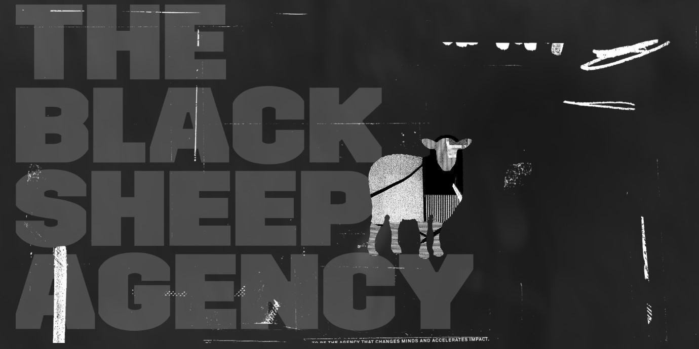
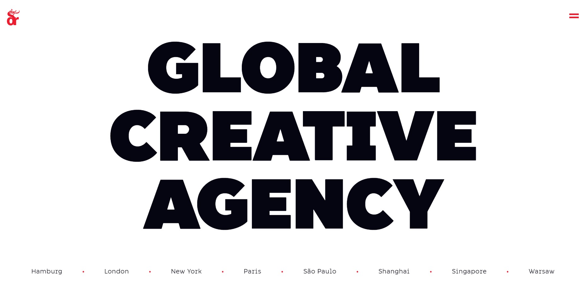
Another existing trend that’s going to stick around in 2020 is loud and proud typography.
Instead of relying on hero images, animations, and videos, you can use bold typography and oversized lettering.
This style of typography is more impactful and increasing the font size and spacing will increase your website’s conversion rate and lower bounce rates.
Take the homepage of Black Sheep Agency as an example:
Or this impactful typography by Dragon Rogue:
Here’s how you can create impactful typography for your website the right way:
The era of cheesy and overused stock images is coming to an end.
Custom images are the new “cool” – and they’re expected to be big in 2020.
A “custom image” can also be an original photography of your products, services, experiences, or people.
Use an image editing software like Adobe Photoshop or Illustrator to splice in or overlay unique designs. The end product will be a captivating custom image that will provide an exciting user experience.
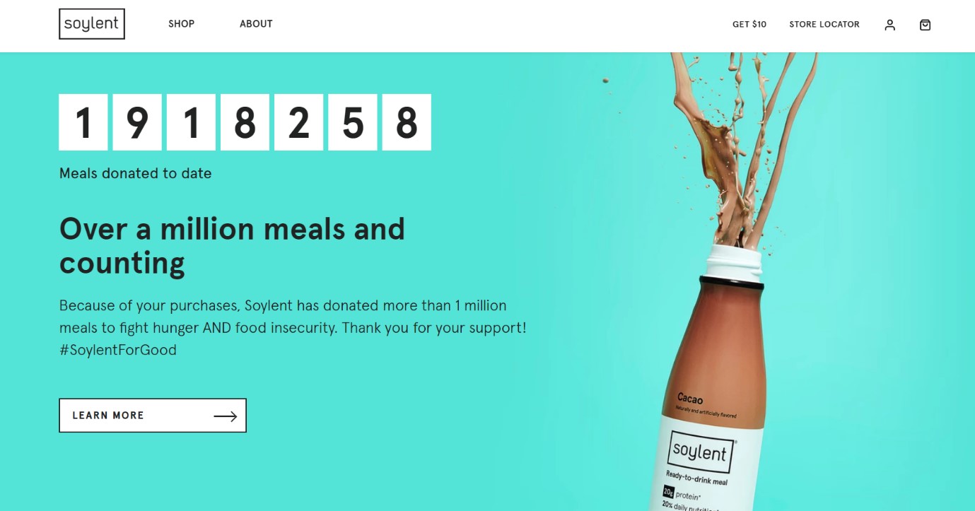
Here’s an example, taken from Soylent.com:
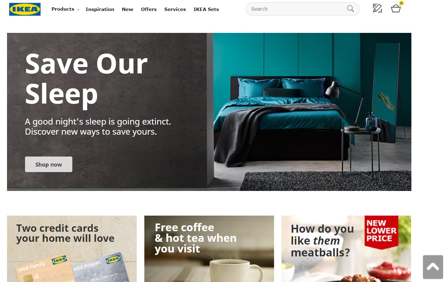
And another example, taken from Ikea’s US homepage:
Here’s how you can get started on creating/using custom images:
Minimalism and more room to play are becoming common on websites today.
Users no longer want to see confusing web designs crammed with content and features.
One of those features is the traditional navigation bar, and it’s disappearing.
Instead of having a long navigation bar with links, more and more websites are using small hamburger/hidden navigation menu icons which expand when clicked.
With hamburger/hidden navigation menus, you can free a large amount of web estate for content, achieve a minimalistic feel, and deliver a pleasant user-experience (especially on mobile devices).
Unlike standard menus, hamburger menus also collapse to reveal the main pages of a website.
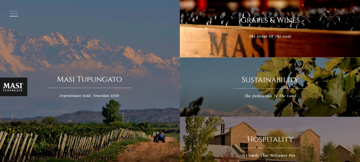
Take the following as an example. This is what the menu (top-left corner) looks like:
And here’s what happens when you click on it:
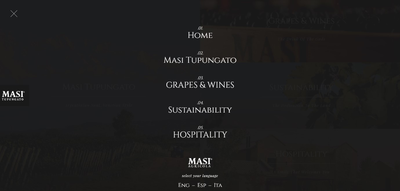
The result – a cleaner, more organized, and easier to navigate design.
Here’s how to create a hidden menu for your website:
<nav role=”navigation”>
<div id=”menuToggle”>
<input type=”checkbox” />
<span></span>
<span></span>
<span></span>
<ul id=”menu”>
<a href=”#”><li>Home</li></a>
<a href=”#”><li>About</li></a>
<a href=”#”><li>Shop</li></a>
<a href=”#”><li>Contact</li></a>
</ul>
</div>
</nav>
Then use the CSS code which can be found here.
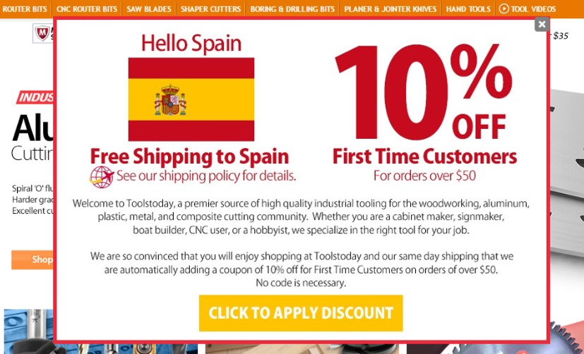
Dynamic content (also known as “adaptive content”) is exactly what it sounds like – content that changes according to the user.
By making use of the user’s data – where they’re from, their browsing history, interactions with the website, their interests, etc. – the content on a website adapts/changes accordingly.
This targeted approach ultimately increases the chances of conversions.
The most common example of dynamic content is personalized recommendations (which are based on previous interactions with a website).
Websites that offer this sort of “personalization” experience 70% higher purchases than others.
But that’s not where dynamic content stops – you can adapt your content to the user’s geographical location and their position in the customer lifecycle, as well.
Here’s an example of dynamic content, adapting to the user’s location (in Spain):
It all sounds fine and dandy, however, implementing dynamic content can be a bit tricky.
Here’s how to do it:
Let’s face it – web designing is no cakewalk.
Developers often have to use hacks and tricks to place elements on a page in certain positions.
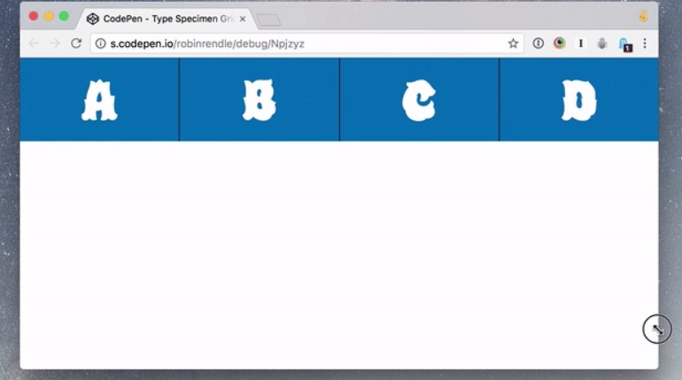
However, thanks to the CSS Grid – a layout engine that lets you organize content in 2D as rows and columns – we now have greater control over the entire aspect of web page design.
At the moment, not many websites are using the CSS Grid. However, it’s growing in popularity and expected to catch on as a trend by 2020.
The best thing about CSS Grids is that it makes the layout of the webpage more responsive. Instead of being hidden on certain screens/window sizes, the content adapts accordingly.
Let’s look at an example – this is how these four grids appear when the window is stretched out horizontally:
When the window is compressed/squeezed, the grids don’t hide, but adapt to the change in the size, like so:
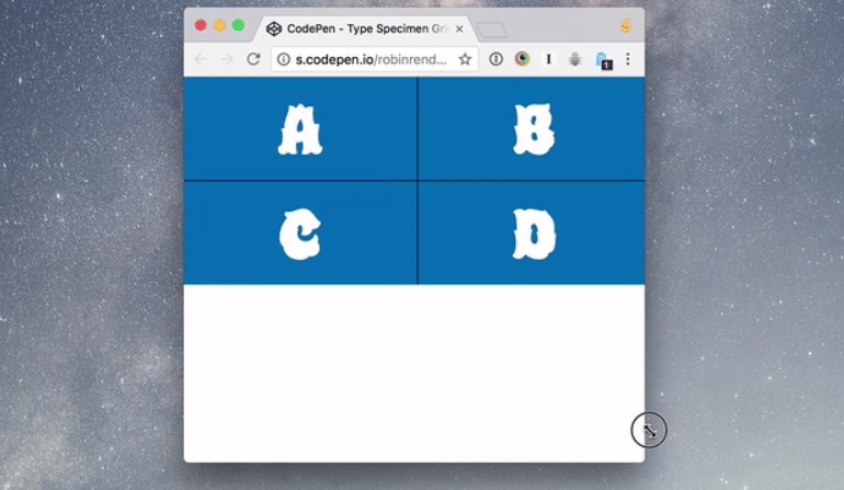
This is the perfect example of the CSS Grid in action.
Check out this extensive library of example-layouts that you can use for your own website.
Here’s how you can get started with CSS Grid:
Considering all of these anticipated trends, it’s safe to say that 2020 has exciting things in store for web designers.
It all comes down to what you plan on doing with these insights. Will you treat this as infotainment? Or will you act on this information and get a head start on your competitors?
The choice is yours!
Did we miss something? What do you think will be all the rave in 2020? Tell us in the comments section below.

In this article, you have successfully managed to explain the various trends in web design. I agree with your point that the design of the website is very important as it helps in captivating the viewers and also helps in holding their attention and thus creating a good image of the brand. Thank you for sharing this article.